I believe all of you has so many experiences of seeing so many web design when surfing in internet. I could guarantee that you often see bad web design layout more than good one. I feel the same way too, there are a lot of websites which has bad web design & layout, so i won’t comeback & bookmark them. I will share some of my experiences of seeing basic visual web design mistakes which makes me leave those websites forever.
1. Bad Font Usage
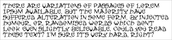
Do you even remember when you visit a website with fancy script font that is very hard to read? Fancy script font must not be used in body text, otherwise your reader won’t be able to read anything. Use fonts that are easy to read.Other mistake is some people use non standard font in their websites. If their reader is only a common person who don’t have so many additional fonts, they will be confused and say, “Why is the font size in this website is very small?” I experienced this when i use non standard font for my website to enhance readability. But unfortunately, it makes people complain about my website. Just use common font like Arial, Helvetica, Verdana, Georgia, or Times New Roman, which every people has in their computer.
2. No Images, Text Only
Believe me, people will be bored if they see text only & they will leave your website once they are tired of reading your ocean of words article. This is internet, not a personal development book. If you don’t have idea about what image you should add, just use any image related with your post title. Don’t leave your body text alone without any images.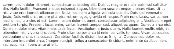
3. No Paragraph On Long Articles
Even though you have inserted images on your article, you should remember to separate some sentences with a paragraph. Imagine that you are reading more than 500 words article without any paragraph on it. It’s confusing right? With some sentences separated with paragraph, people will find it easier to read your article.
4. Very Tiny Font Size
Have you ever visit a website and you have to zoom in to read the content? This is bad, make your body text at least 12pt to make sure that your body text are readable enough. If not, people will have to provide large magnifier to read your article.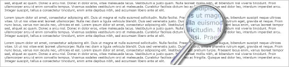
5. Heavy Flash Usage
Almost any Flash usage will bring added value to your visual perception. But unfortunately, Flash usage will only make your website slower to open & it gives more chance for new visitors to leave you quickly. Reduce usage of Flash, unless it’s needed to explain something. I personally don’t really like websites which has Flash intro. They are really annoying & wasting my time.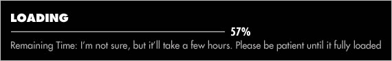
6. Body Text Above Colorful Background
Most of good websites use plain color background to enhance its readability. If you use colorful background to make it nicer, you are absolutely wrong. It only makes people tired of reading your articles, because the body text color are blended with background image. Make your background plain & put image somewhere else where there are no text.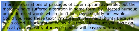
7. Too Many Advertisement
Have you seen a website full of banner advertisement & google adsense inside? I’m sure that you will leave that website once you have done with it, Or worse case, you will instantly hit close and move to another website. Never prioritize advertisement over content. Good websites always place advertisement in a proper places which aren’t bothering the main content of websites.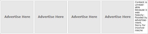
8. Unwanted Pop Ups
I always hate websites which has unstoppable pop ups. It really annoys me. I want to look for information, but the pop up interferes & wastes my time. I don’t know why, but i really hate pop ups.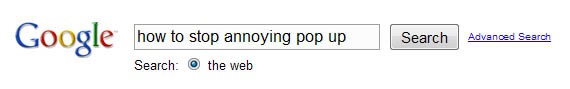
9. Too Long Articles
I don’t know about you, but i don’t like too long articles. It takes you more time to write it and also make people bored to read it. Make it at most 1000 words with some image addition to make it more attractive than just a plain text. Make your words simple & understandable. Believe me, most people doesn’t like too long articles.10. Links Color Aren’t Visible
Make sure that link color has different color with body text color. It helps your reader to identify which links they have visited and also help them not to visit the same links unintentionally.
Don’t forget to share your thoughts about the article in comment section.
Comments